About the Project
The Internet is an integral part of our daily lives, for many of us it is an increasingly important resource in many aspects of life: education, employment, communication, commerce, entertainment and more. However most websites have accessibility barriers that make it difficult or impossible for many people with disabilities to use them. Therefore it is important to provide equal access and equal opportunity to people with disabilities and develop websites with web accessibility in mind.
What is Web Accessibility?
Web accessibility means that people with disabilities can use the Web. When we talk about disability for the majority of people the extreme situations such as blindness, deafness or total disability comes to mind. But millions of people have reduced vision or color blindness that makes it difficult to use websites with inappropriate color palette. People with motor skill disorder could have a hard time using a mouse or it is a completely impossible task. These and other impairments greatly affect the use of the Web.
Flexibility to meet different user needs, preferences and situations is a key principle of accessible web design. This flexibility has many advantages because it also benefits others, including older people with changing abilities due to aging, people with "temporary disabilities" such as a broken arm, mobile device users or people using a slow Internet connection.
Objective
Considering the main types of interaction methods that people with disabilities use to interact with websites we can define the following requirements that we need to meet when designing for accessibility.
- Keyboard access: not everyone uses a mouse to interact with web pages. Some people use keyboards instead so it is essential that any interactive parts of the pages can also be operated with a keyboard.
- Screen magnification: keep the site easy to use when zoomed in or magnified. Do not lose content and functionality. Key elements should be consistently placed across all pages.
- Screen reader: all content can be interpreted with screen reader software. Provide alternative text and description for images.
- Cognitive issues: the context and functionalities of the site must be predictable and easy to understand. Color / contrast must be in balance.
I am not listing the requirements of a webshop here because the primary subject of this project is accessibility. The site is built using HTML, CSS, JavaScript, PHP and MySQL.
Solution
There are a number of specific things to look out for when designing an accessible website, but knowing these requirements before the design and implementation process makes it easier to prevent accessibility problems.
Keyboard Use
People who are unable to use a mouse or see the screen need to rely on keyboard alone. It is important to allow these users to follow along with where the keyboard focus is, navigate to all interactive elements, and bypass the navigation if there are many links.
Let's talk about keyboard focus first. It is necessary to have a visual indication of where the keyboard focus currently is, without such feedback it would be impossible to use the website for a keyboard user. Commonly the focus indicator is removed by designers because it's thought to be an eye sore. Well let's not make that mistake and instead we can replace the browser default with a design that is consistent with the site's look.
See the Pen Keyboard Focus Example by VZKiss (@vzkiss) on CodePen.
Try above how various form elements behave when they are in focus.
In HTML, only links, form fields and buttons are recognized by a keyboard as interactive elements. These elements have native support for keyboard interaction and focus. To create the site's responsive dropdown navigation I had to use JavaScript to display or hide the navigation items when the screen size is small. Users must be able to use the navigation regardless of whether they are using a mouse or a keyboard so using an anchor element that has native keyboard support is a good choice for the 'Menu'. When it's clicked it triggers the slide function. When we tab trough the page with a keyboard, we can select and use the 'Menu' in the same way as if we were using a mouse.
See the Pen Responsive Dropdown Menu by VZKiss (@vzkiss) on CodePen.
Try keyboard navigation on the menu. Resize window to swith between mobile and desktop view.
Keyboard and screen reader users usually must navigate through long list of navigation links, sub-lists, icons, search and various other elements before arriving to the main content on a webpage. This could be a very difficult and time consuming task. Imagine users with some form of motor disabilities, or users with no arm movement who use computers by using a stick in their mouth to press keyboard keys or have to use some other alternative method.
Mouse users can interact directly with any of the links in the main content area. Offering a skip link at the top of the page which jumps the user to the main content area will provide the same benefit to keyboard-only users. Let's call this link "Skip to Content".
One way to accomplish this is making this link invisible until it receives keyboard focus. This benefits sighted keyboard users who will see the link when they navigate to it, screen reader users who will hear the link and sighted mouse users don't see it.
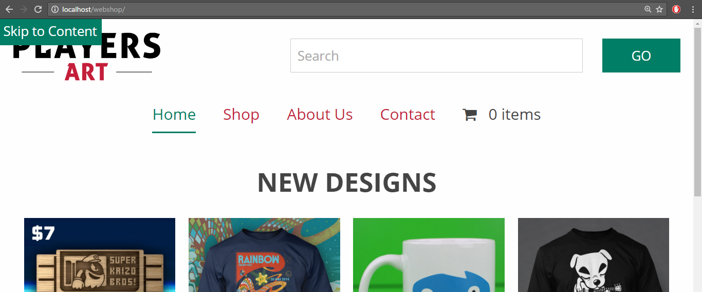
Skip to Content link becomes visible when it receives keyboard focus.
Sometimes it is a good idea to provide multiple skip links, but overdoing it defeats the purpose of such links, typically one or two skip links is sufficient.
Magnification
People with mild to medium visual impairments will use screen magnification or the browser's zoom function to read web pages. Designing a site with clear indictors for different content areas and well structured pages will benefit these users.
Key elements such as navigation and search should be consistent across all pages. When the area of the screen the user is focused on is magnified multiple times they don't see the whole screen at a glance. A common strategy is to look for key landmarks on a page that they can orient themselves by. Knowing the navigation is on the top of the page makes it easy to move the magnified area to the edge of the window, and then they know immediately where they are.
Users who browse the website without the need of magnification can see the shopping cart and its content at all times on the top of the page. When someone adds a new item to the cart it is updated and the item count changes. However when the screen is magnified this isn't visible so if an "Add to Cart" action was performed the user needs to move all the way up to the navigation to make sure it did. This doesn't leave screen magnifier users with a good user experience. A good way to inform these users that an item was indeed successfully added to the cart without the need of moving away from the "Add to Cart" button, which they might use again immediately, is to provide this information below the button and include a "View Cart" link for convenience.

View Cart link becomes visible after adding a product.
Some people may use the browser's zoom functionality to magnify pages. Designing websites to be fluid with responsive design techniques by using CSS to control presentation, relative unit of measurement to control font size and page widths will help people to see the same content and use functionalities as in the browser's default view. When zooming in pages will have the same look as in tablet or mobile view depending on the zoom percentage and the content will scale without pixelation and information loss.
Screen Readers
Screen reader applications attempt to identify and interpret what is being displayed on the screen. They will read the content in the order it's presented in the HTML and deliver it to a blind user as speech or by driving Braille display. Designing a website with well formed HTML code, which conforms to the official programming language specification will enable these programs to work with better efficiency and accuracy.
Ensuring that information conveyed with graphics is available when using screen readers (or images are switched off, can't be displayed) is essential. Using the required alt attribute that specifies an alternate text for an image is just the first step. In case of complex images, illustrations where the page text relies on the user being able to understand the image the long description is needed. This is situational and should be used when it's appropriate. For example, using the longdesc attribute that specifies a hyperlink to a detailed description of a product image will benefit people using the website with screen readers.
Cognitive Issues
There are many different types of cognitive disabilities and effects that they can have on users. They can increase or manifest with age and abilities vary from person to person and can change over time. Some of the common types of cognitive disabilities are intellectual disabilities, language and learning difficulties, head injury, stroke, Alzheimer's disease, dementia. These conditions can affect memory, perception, problem solving, attention, concentration. It is a complex issue because users needs vary across these disabilities and it's difficult to define recommendations that will universally help all users.
Despite the difficulties there are some principles we can follow that are based on common sense and assumed best practices. Some of these are the following:
Navigation
- Keep navigation consistent throughout the site.
- Menus should be short and easy to understand. Use clear labels and signs.
- Provide feedback to let users know if they made the correct choice and to help them when there is an error.
- Increase the size of "clickable" areas to aid users who have visual processing or mobility challenges.
Context and Text
- Use simple and appropriate language for the content.
- Use correct grammar and spelling.
- Organize content into well-defined groups. Use meaningful headings, lists and other visual mechanism.
- Support increased text size.
Layout
- Consistency is important. Similar interface elements (search, logo, etc.) and similar interactions should produce predictable results.
- The design of a page (white space, color, images, etc.) should focus the user on what is most important.
- Highlight urgent or key information.
- Use high contrast between text and background.
- Use white space for separation.